THIS ARTICLE/PRESS RELEASE IS PAID FOR AND PRESENTED BY University of Oslo - read more
Improper use of colours can distort scientific data
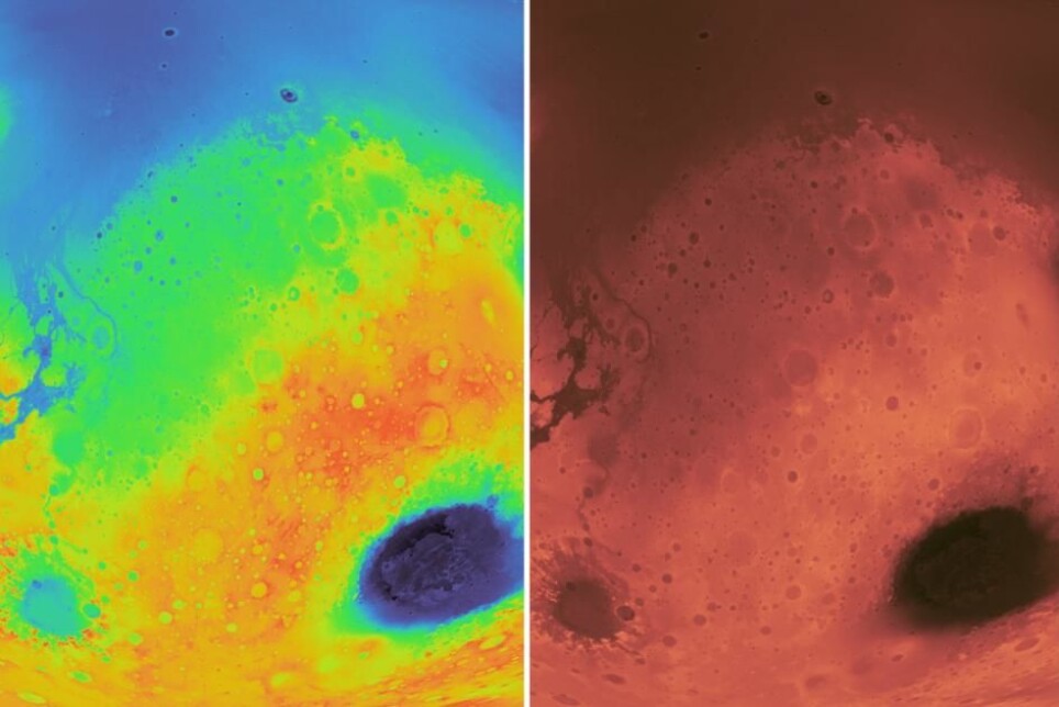
Which of these Mars images says the most about what the planet really looks like? Researchers are encouraged to become more aware when colouring.
When you see the weather forecast on TV or online, the maps of meteorologists are often full of colour. It's not because the world looks exactly like this, but because it's easier for us to understand what the maps really show.
Researchers use colours in this way all the time, both when they write for each other in scientific journals and when they try to communicate to the general public. Maps of planets, overviews of geological conditions and avalanche hazard and the distribution of plant and animal species are just a few examples.

But how aware are the researchers of which colours they use in different contexts? Not very much, according to Fabio Crameri and Grace Shephard at the Department of Geosciences, University of Oslo.
“People do not put enough effort into understanding what they should use in terms of colours,” Crameri says to Titan.uio.no.
He has developed a service where researchers and others can create better illustrations with colours that better match what they actually want to show.
“It sounds trivial, but the colour aspect is in fact really important. It is how we communicate data,” Shephard says.
All the colours of the rainbow
It is most common to use a colour chart based on the colours of the rainbow. A little red, a little blue, a little green, a little yellow and so on.
Although it is known as the Red Planet, Mars is not bright red. And definitely not green, yellow and blue.
“If you google “Mars topography”, you only see rainbow colour maps”, Crameri says.
For example, it looks like this:
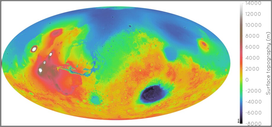
“Displaying Mars through rainbow colours hides whole craters in the greenish coloured areas, adds artificial boundaries for example between purple and red, or yellow and green colours, and is not at all intuitively readable.”
“Whether purple, yellow, or white colour means higher values is not immediately clear, and using blue colours for lowlands makes it appear as if there is an ocean on Mars. There is not,” Crameri says.
It's much better to show it like this, according to Shephard and Crameri:
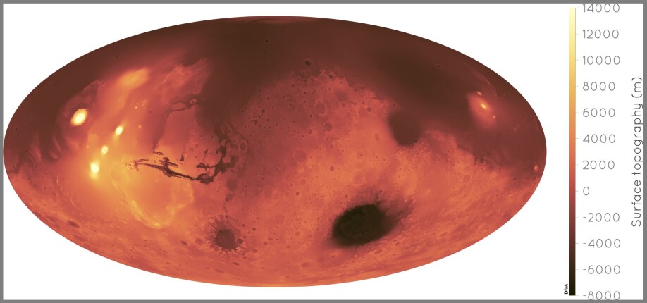
“Using the scientifically derived colour palette makes the Red Planet not only immediately recognisable, but also displays the data intuitively and without distortion, also to colour-blind readers,” Crameri says.
Creates artificial boundaries

The use of sharp colours that are easy to separate may seem obvious. But are there really such clear boundaries on a map, for example?
“Most of the strong borders of the rainbow colour map are artificial artifacts. They are not really there,” Crameri says.
“A rainbow colour map adds artificial boundaries. We get feedback from people saying they like the rainbow, it has high contrast and it shows more data, but that is actually not true. It is in fact distorting it,” Shephard says.
The colours of the rainbow can create problems especially for people who are colour-blind. Approximately 8 percent of all men and 1 percent of all women have deficient colour vision, according to Great Norwegian Encyclopedia.
“Take for example hazard maps showing the trajectory of hurricane paths. If people who are colour-blind can't understand them, then it is not very effective hazard or science communication,” Shephard says.
Should not be used on scientific data
The problem is much bigger than that. It is simply unscientific, the two geologists believe.
“We are definitely not on a rampage against all use of rainbows in general, but it should not be used for scientific data,” Shephard says.
To show the benefit of using Crameri's colour maps, which he calls "scientific colour maps", as opposed to the unscientific rainbow charts, they have made images of an apple, the Earth and Marie Curie using various colour maps.
You can see the original black and white images in the middle, on the left in the rainbow version and on the right with a scientific colour map.
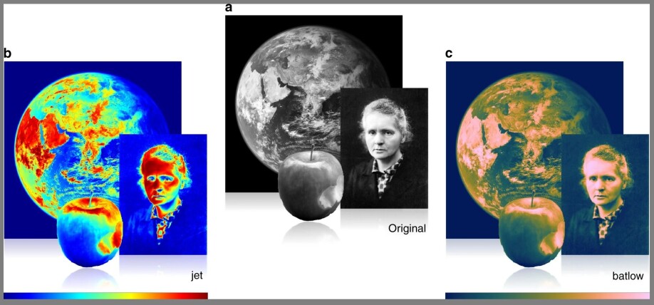
“The black and white is representing the original figure. It is very intuitive, you can see all the details of the face and the apple. If you do it in a scientific colour map it looks the same, all the details can be seen and understood clearly.”
“But if you colour it with a rainbow colour map, you see where these artificial gradients start to distort the impression you get from the data,” Crameri says.
It's getting hard to see that it is an apple, especially if you only see a part of it, and Marie Curie looks like she's been the victim of one of Andy Warhol's pop art projects.
“This is very dangerous because in science we often don't know in advance what something looks like. Then we can make the wrong conclusions based on this artificial gradient,” Crameri says.
Hard to change old habits
Why do scientists still choose to use rainbow colours?
“Studies have found that the common use of the rainbow colour map is the main reason people still keep using it. Many people think these colours stand for science and so they use it,” Crameri says.
It may also be tempting to use the sharpest colours to show off what you think is most important.
“With a rainbow you can shift it so the brightest, most clear parts highlight some part of your data. You can almost use it to cheat and produce the results you want,” Crameri says.
Service to the science community
Crameri and Shephard now offer free downloadable and easy-to-use colour map solutions. They also provide a simple guide to the use of colours in science.
You can find it here: Scientific Colour Maps.
“We outline the problem, but we also provide a solution to it. It is easy to apply a scientific use of colour by just downloading these colour maps. You can install them in any kind of software,” Crameri says.
Now they hope fellow researchers from around the world will awaken from their dogmatic colour slumber.
“This is a service to the scientific community. There is resistance, people don’t like to be told what to do. But there is no good argument on a scientific basis for continuing using a rainbow colour map,” Shephard says.
Reference:
Fabio Crameri et.al.: The misuse of colour in science communication. Nature Communications, 2020.
———
Read the Norwegian version of this article at forskning.no

See more content from the University of Oslo:
-
Archaeology is helping researchers understand the effects of forced displacement
-
For 'Amalie,' going to prison was devastating. But it helped her get sober
-
“My pulse quickens every time someone says that children and young people are digital natives"
-
This offers hope for people living with dementia
-
The pressure from magma can fold solid rock in less than one day
-
Study: Art can be a safe space for artists with minority backgrounds


