THIS ARTICLE/PRESS RELEASE IS PAID FOR AND PRESENTED BY NILU - Norwegian Institute for Air Research - read more
Researchers have collected Norwegian emissions on a map
Emissions from firewood, traffic, construction machinery, and aircraft are some of what they have collected and visualised in a map.
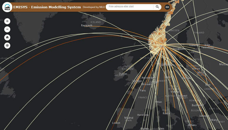
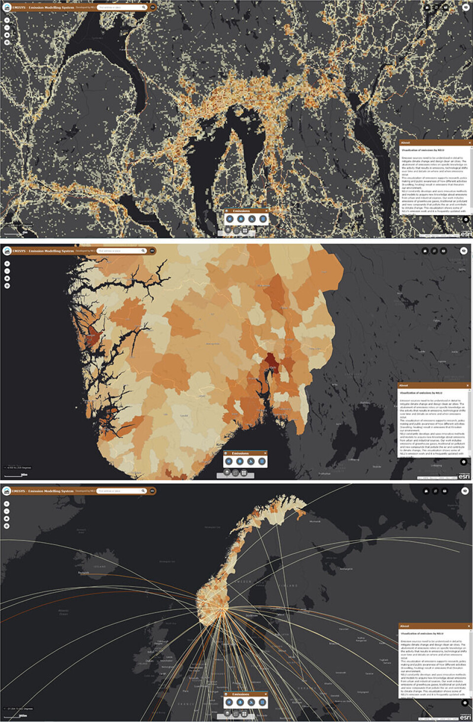
When you open the portal EMISYS – Emission Modelling System, the first thing you see is a map of the area around Oslo. You can navigate around the country, and by zooming in and out you will see different types of emissions.
What kind of emissions you see can be selected in the menu at the bottom of the screen.
By zooming in you will see the high-resolution local emissions from road traffic, wood burning, and machines used in building and construction. When you zoom out, these emissions change to municipality level.
If you zoom out even more, you can visualize first emissions from domestic aviation, and then emissions from international aviation. The darker the grids or lines you see, the higher the emissions they indicate.
Shows the relevance of high-resolution emissions
The researchers were inspired to create the emission map by a research group in Finland.
"We wanted a place where we could collect the emission results from the models that we develop and make them visually available on the internet. Emissions does not have to be displayed only as graphs. When emissions show up on a map, they become more relevant for the municipalities and the general public – you can see both where they occur and what they are due to," senior researcher Susana Lopez-Aparicio says.
The visualisation as a map is based on different models that the two scientists have been working on over several years: models to estimate emissions from wood burning, traffic, construction machinery and aviation.
"At some point we would also like to add more data. Our dream is to further develop the platform to show emissions in real-time," says Lopez-Aparicio. "The more data we add, the more comprehensive the picture of our emissions to the atmosphere will become."
Emissions from Norwegian tourism
The 'flight routes' on the map show both domestic and international aviation routes. Some of them are considerably darker than others.
"The highest emissions are from flight routes to Spain, Thailand and Greece," explains scientist Henrik Grythe. "We Norwegians go abroad a lot, more than others travel to Norway."
He continues to explain that 90 per cent of the total emissions between Norway and Greece are associated with Norwegian travellers. Greeks travel much less to Norway than the other way around. The same applies to Norway and Thailand, and Norway – Spain.
The data in the platform have been produced in several projects that NILU has carried out for others such as the Norwegian Environment Agency and Innovation Norway. Their colleague Dam Thanh Vo did the GIS visualisation.
"We have not added emission data that are available from other sources, such as shipping emissions from the Norwegian Coastal Administration. We have focused on data that we produced by ourselves," says Lopez-Aparicio.
Wanted: additional collaboration
Grythe further comments that what we see on the map now is pure emission data. However, there is a lot of other publicly available background information that may be interesting to link to the emissions.
Examples of this can be number and types of dwellings, buildings or construction projects in a specific area, socio-economic data, population density, energy sources for heating, and vehicles or road properties.
This may be relevant to use in different types of projects, but often require some effort to obtain and familiarise yourself with or produce yourself.
Lopez-Aparicio and Grythe hope that the visualisation can work as an invitation to other researchers who work with emission-related issues.
"If other researchers would like to use emission data that we have or have data that can be included in our models, feel free to contact us," says Lopez-Aparicio.
The two researchers can assist with both data use and retrieval, as well as supporting the interpretation and compilation of additional data.

See more content from NILU:
-
Summer in Central Europe: Drought and wildfires to be expected
-
How do you design a healthier place to live?“I would prioritise easy, car-free access to everything you need in your daily life"
-
Fires in tropical forests affect more than just the forests
-
Engineer Sam Celentano found 222 grams of gold in a laboratory. What was it doing there?
-
Air pollution levels are still too high across Europe
-
Researchers have discovered how biological particles affect the clouds over the Arctic


